
Monday, 25 February 2013
Mockup contents page

Monday, 11 February 2013
Ideology
An ideology is a set of beliefs behind a piece of text. This means that behind certain pieces of media and media text there is a meaning or a set of ideas presented through the text, for example i could write as text about achievement and the ideology or the idea that i would be trying to get across would be how well to achieve.
In my school newsletter that i will create, i will aim it at the parents of the pupils. i will involve things such as achievments of pupils and how the teachers care for the pupils. i will involve pictures to show how the teachers care for the students and calanders of upcoming events to kepp them up to date. The ideology of my newsletter will show how we aim to get the pupils the best chance they can get and how we can help them to achieve the best they can. The school badge would link in with the aims of our school and portray what we expect. i will portray my ideology with tables of results, pictures, text and calanders also i will provide more information on upcoming events.
In my school newsletter that i will create, i will aim it at the parents of the pupils. i will involve things such as achievments of pupils and how the teachers care for the pupils. i will involve pictures to show how the teachers care for the students and calanders of upcoming events to kepp them up to date. The ideology of my newsletter will show how we aim to get the pupils the best chance they can get and how we can help them to achieve the best they can. The school badge would link in with the aims of our school and portray what we expect. i will portray my ideology with tables of results, pictures, text and calanders also i will provide more information on upcoming events.
Monday, 4 February 2013
Semiotics
Semiotics,is the study of signs and sign processes , indication, designation, likeness, analogy, metaphor, symbolism, signification, and communication. Semiotics is closely related to the field of linguistics, which, for its part, studies the structure and meaning of language more specifically. However, as different from linguistics, semiotics studies also non-linguistic sign systems. Semiotics are used throughout society and are seen everyday they do not use words more signs and symbols. Semiotics is often divided into three branches:
- Semantics: Relation between signs and the things to which they refer to their meaning
- Syntactics: Relations among signs in formal structures
- Pragmatics: Relation between signs and the effects they have on the people who use them
magazine research part 2
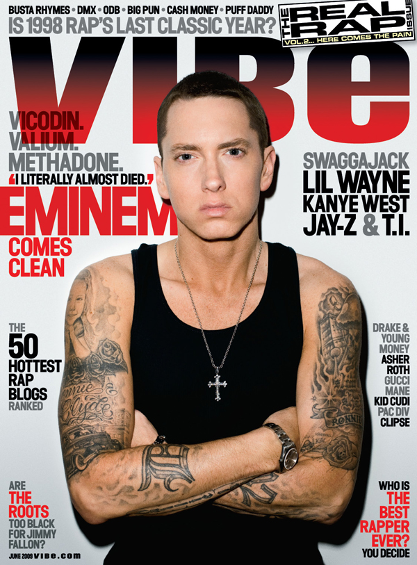 |
| This is an example of another music magazine that i have researched into, the reason i chose this particular cover was because i liked the way the mast head or main title was covered slightly by the photograph it looks really effective and professionally done. The colour scheme looks very effective as well. This has given me a very good idea about how i want my magazine to look and what i want on the front cover. |
 |
| This is an example of another magazine type i have researched, NME focus more on the indie side of the music genres . the thing i like about this front cover is the bright colours, they are eye catching and draw the reader in. The picture of Liam Gallagher is a natural looking picture, i can do this in Photoshop by using the air brush tool, this can make the picture look like it has no imperfections. |
| Here is another example of the rolling stone magazine i really like the design of this magazine because its not too crammed and draws the reader in. The colour scheme is always matching on this magazine and it looks really good. |
Sunday, 3 February 2013
Music Magazine research
It is a good idea to research into the different types of music magazine that are already out on the market, this swill help to give me a very good idea to what i would like my music magazine to be like and a better insight to how I am going to put it together. Therefore i have decided to have a look at a variety of magazines to make sure i make mine in the correct way.
 |
| This is one of the magazines that I have decided to look at because I like the style of the magazine and the way it is set out. Another thing i really liked about this magazine is the colour scheme as i think it looks really effective with the picture of Jimmy Hendrix. The way the picture is in black and white makes it look a lot more effective and quality looking. This will help me with the Photoshop that i will use in my project, as it helps me see what effects look good and what colour schemes look good together. |
Subscribe to:
Comments (Atom)