 |
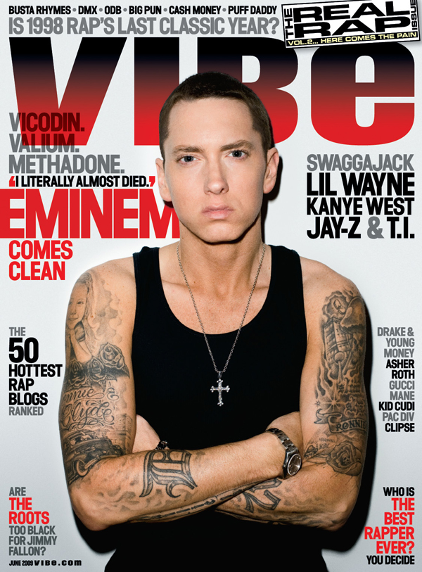
| This is an example of another music magazine that i have researched into, the reason i chose this particular cover was because i liked the way the mast head or main title was covered slightly by the photograph it looks really effective and professionally done. The colour scheme looks very effective as well. This has given me a very good idea about how i want my magazine to look and what i want on the front cover. |
 |
| This is an example of another magazine type i have researched, NME focus more on the indie side of the music genres . the thing i like about this front cover is the bright colours, they are eye catching and draw the reader in. The picture of Liam Gallagher is a natural looking picture, i can do this in Photoshop by using the air brush tool, this can make the picture look like it has no imperfections. |
| Here is another example of the rolling stone magazine i really like the design of this magazine because its not too crammed and draws the reader in. The colour scheme is always matching on this magazine and it looks really good. |
No comments:
Post a Comment